
Heeellloooo! And we’re back again with another house reveal. This time it’s Toad and Mandy’s haunted 150 year homestead. While I still think they mascaraed the home, I also think it’s better than previous weeks. The rules weren’t too outlandish, but again there was no consistent theme throughout. I was hoping for light, white, Hamptons with linens and natural colours. But naaahhhh, let’s not be boring, let’s do bright green, blue and mulberry…
Toad and Mandy’s rules:
- Turn our tired old lady into an elegant homestead
- Colour with jewel tones
- Get dark and moody in an art deco master suite
- Make a big, blokey butcher’s kitchen
- Create a contemporary but classic bathroom
Let’s look at all the photos…
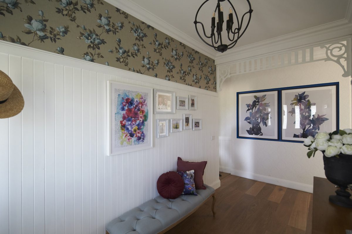
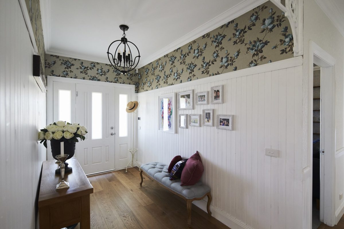
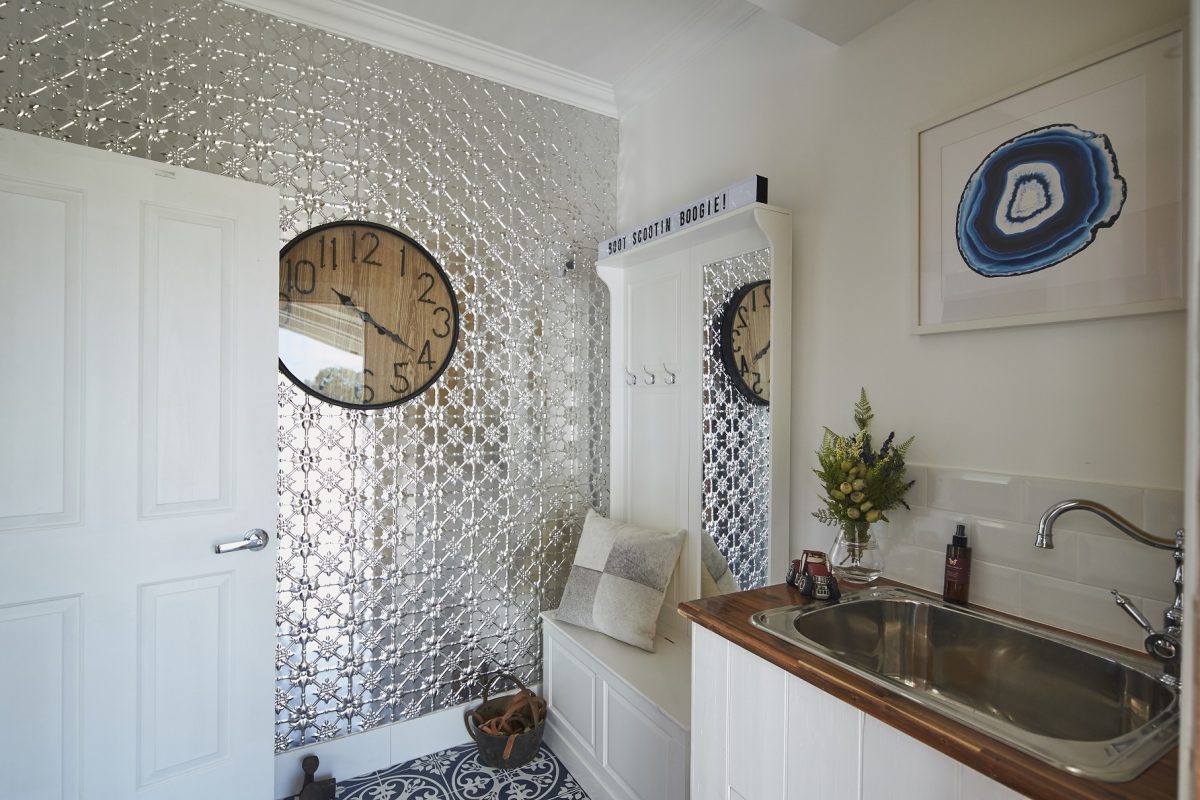
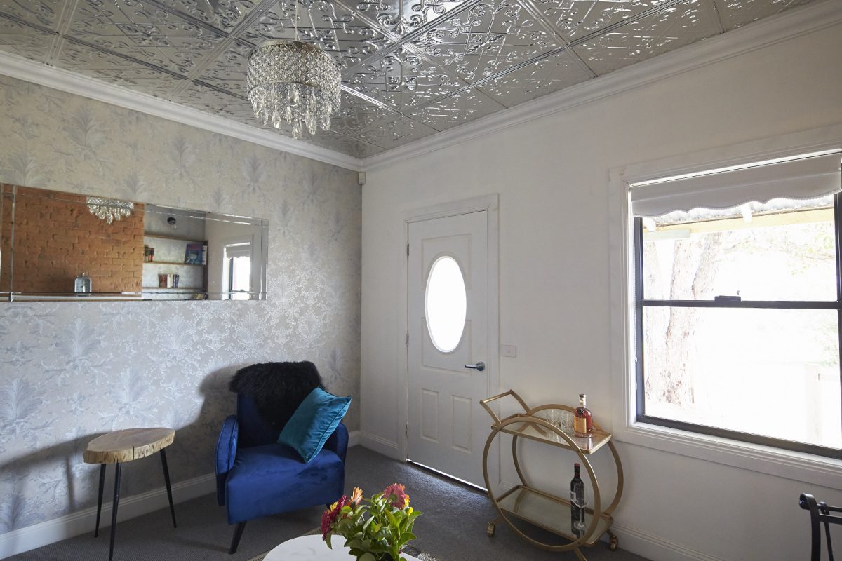
Jess & Jared (Laundry & Entry)
It was ok. It worked well with the rules. The laundry sink and door was gorgeous. The floor tiles were cute. It was within the general theme of the house. The artwork is out of control in the home though.


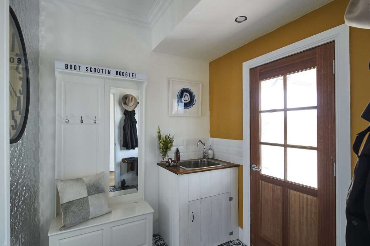
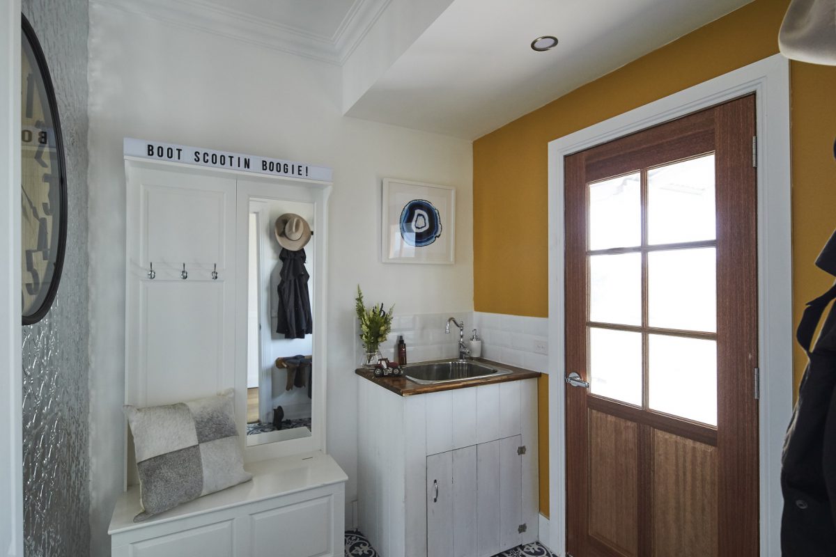
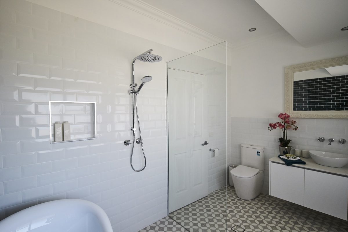
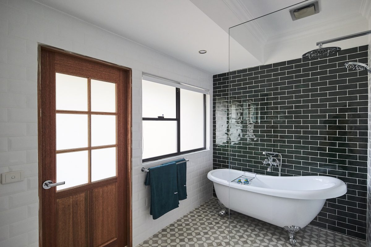
Josh & Brandon (Boot Room & Bathroom)
The boot room was disgusting. The pressed metal was too much! And then the yellow. It was only a tiny space, but some proper cabinetry would have been better. The bathroom was ok. I actually don’t mind the green subway tiles (but not with the floor tiles too). They could have chosen a better mirror though and I always like a double sink in a master bathroom.

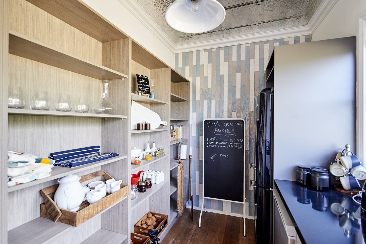
Chiara & David (Scullery & Lenny’s Bedroom)
The scullery followed the country theme – not sure it matches the kitchen though?? It’s a bit junky. The ceiling wasn’t necessary! Lenny’s room – it’s cute and he will love it.
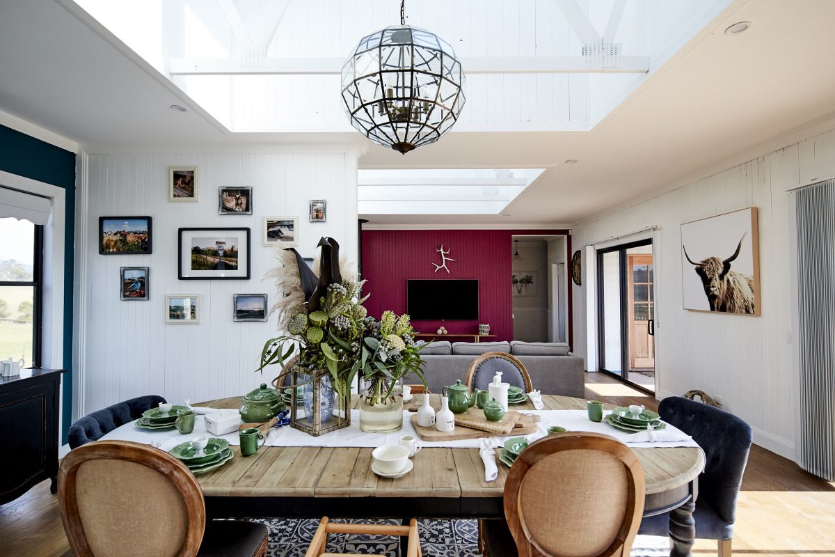
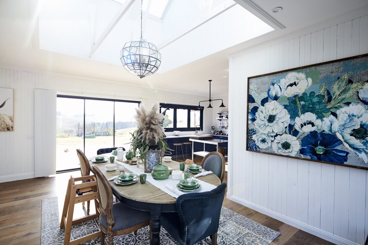
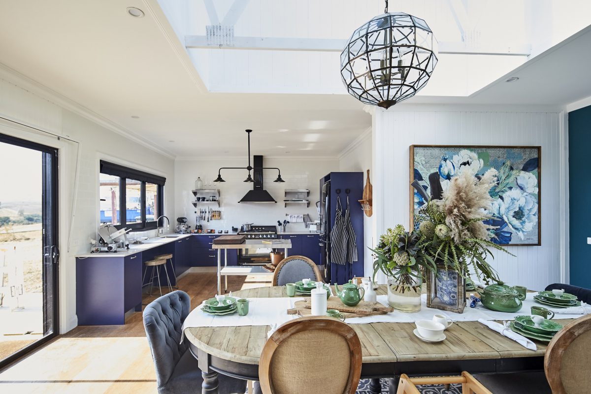
Mel & Dave (Layla’s Room & Dining Room)
Again, kids room – I don’t like to criticise it because it’s their special space and it’s actually not that bad. Thank god the dining room had the skylight void area. There’s a lot going on in there! Practicality wise the fabric chairs and a rug under the table probably isn’t going to work for a family but I did like the table.
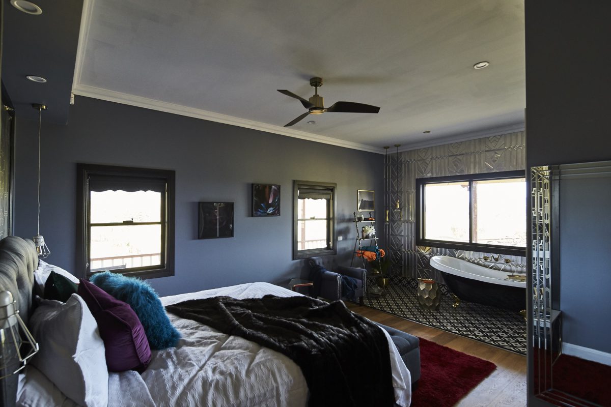
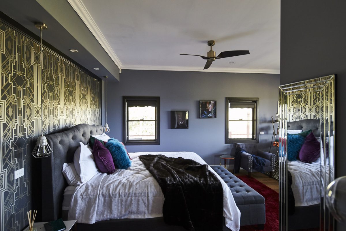
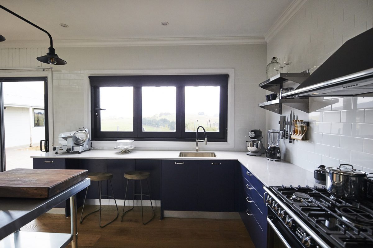
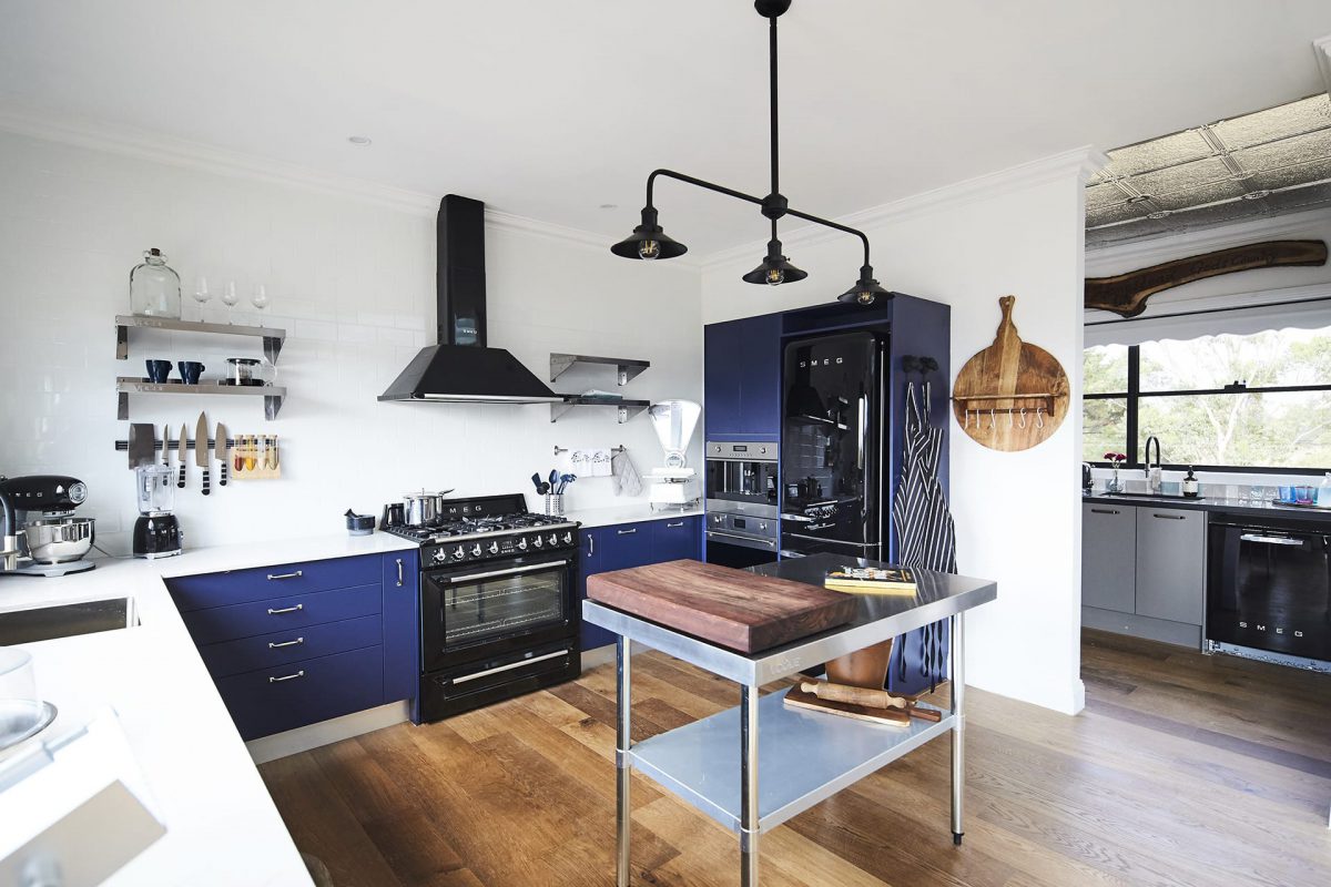
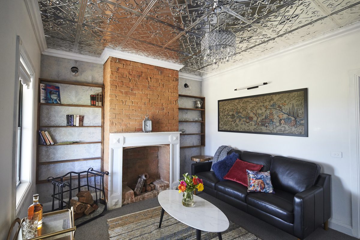
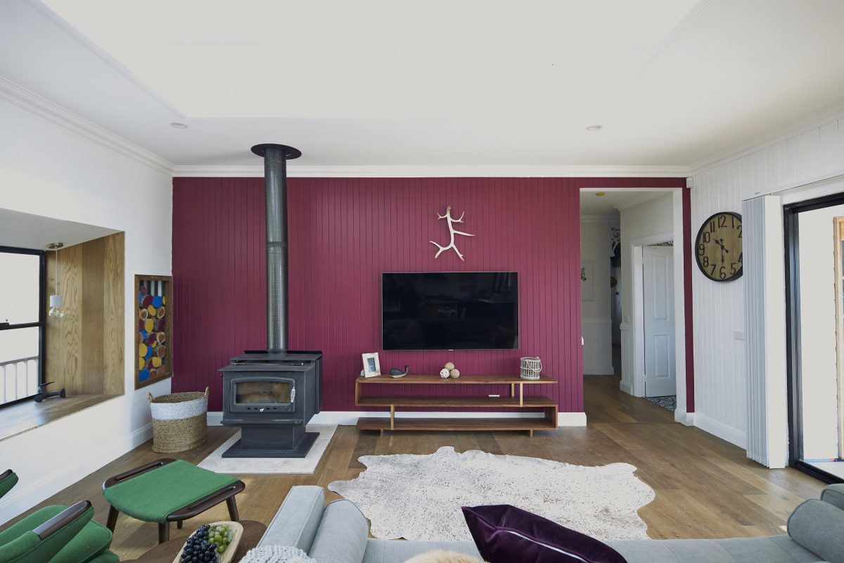
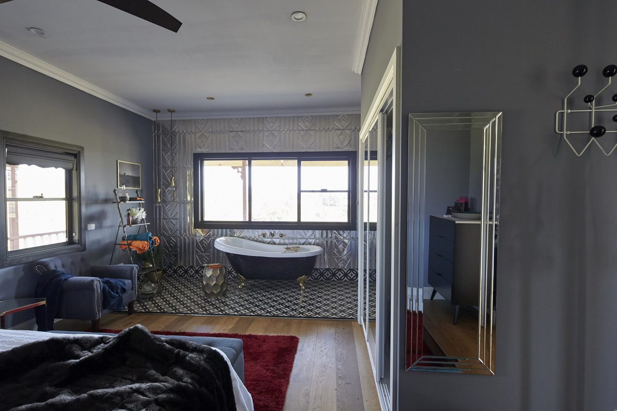
Kim and Michelle (Master bedroom, Kitchen + Bonus Room)
They’ve wrecked it haven’t they? What is this room??? I know the rules said art deco but that didn’t mean make an average bedhead, throw in those red shaggy rugs again and PAINT THE WINDOWS BLACK! It’s gross. It could have been amazing. Why did they let the ensuite be open?? NOPE.
The kitchen – it’s actually good. I don’t mind it. It works well, uses some colour and is within the rules.
Then they had to go and wreck the sitting room. That’s foul. The colours are so drab and the pressed metal doesn’t work. This is my least favourite room. The artwork is wrong, the coffee table is wrong and the floor rug is WRONG. It really lets the house down.


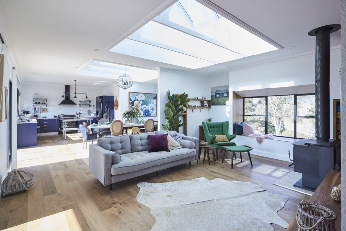
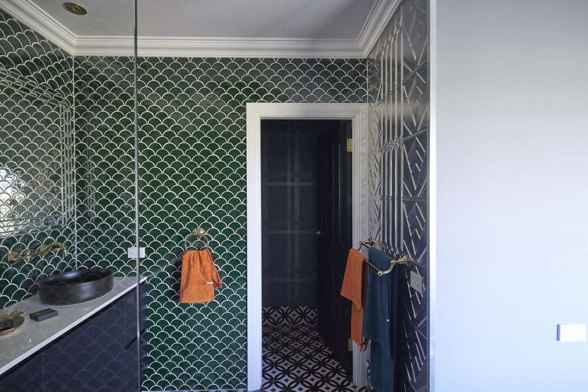
Leigh & Kristie (Lounge Room & Ensuite)
Again, the only saving grace is the skylight here. Otherwise it would be very closed in. There’s way too many things happening. The couch is not suited to a family with little kids. The fireplace should be the feature with some built in cabinets. Where do the little kids watch tv and hang out? This could have been a much better space with a chaise lounge and less clutter.
The ensuite – again I don’t mind the green tiles, but then that’s all I liked. I hate the open ensuite in to the master. Everything was so over done.


What did you think??
You can see the previous renos here and meet the contestants here.
♥ KC.