Follow my renovations on Instagram.

House update: wallpaper in my entry

I had always thought I would wallpaper a little wall in my entry. I wanted it to be cool, funky and fresh. It’s a tall wall, and everyone can see it when you walk in. Normally I would go for something safer, but I have always loved these prints from Anna Spiro and Porter’s Paints, so I decided to order some samples….

photo3

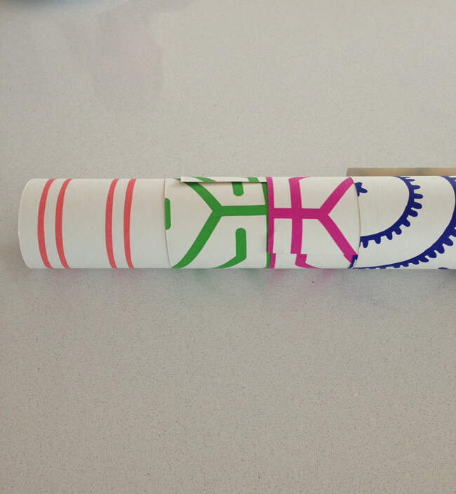
They are very bright! My husband did a double take and said “please not the pink or orange…” Haha! I’m ok with that decision. I really love the orange stripe pattern, but maybe in the blue colour?

photo

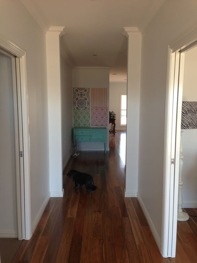
Ooo and look, there is my doggie. So of course, I need to style the cupboard and you can see in the background there is a sideboard and a very big mess – I still have not unpacked everything!
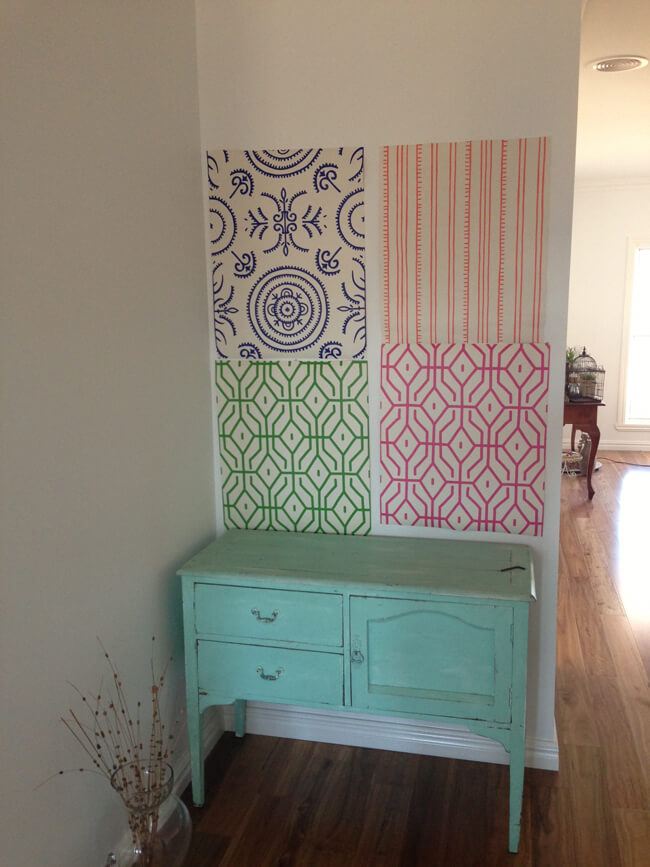
photo2

What do you think?

You can see the whole range here.

41 comments

  • Laura

    I love the green one. The blue reminds me of the blue patterned plates that nannas have! Plus I just love anything green 🙂

  • Hayley

    I think the green one too. I think the blue one has a more Mediterranean feel. The house looks great though, so much light!

  • Scandi Coast Home

    The best way to decide is to have an overall concept of the look you’re trying to achieve in the entry through to the living area. Then you will have your answer.
    I personally like aqua and indigo together and I like the round, bold pattern. The stripes don’t seem to have much impact.
    Whichever wallpaper you pick, I think a fabulous mirror above the aqua console would finish it nicely (not too big too hide the wallpaper though).
    Ok, I’m done now.
    Tania xx

  • Scandi Coast Home

    actually, the geometric design in navy would look sophisticated.
    Tania xx
    PS. Apparently I wasn’t quite done ;O)

    • Katrina (author)

      Thanks love 🙂

  • Jen

    I LOVE the blue and the orange!

    The others are nice too, but a bit too busy for my liking. I find them very hectic.

    The blue one to me is a very calming pattern.

    🙂

    • Katrina (author)

      I do like the blue a lot too.

  • Sara

    Blue by far. I agree with above comment saying the blue adds sophistication, you already have your brightness in the cabinet, now you just need to add the pattern to highlight. I think the cabinet would be lost in the other colours!

  • Melissa

    I like the top 2 designs especially the blue. but colourwise I actually dont mind the orange. Its a hard one to decide.
    What would also be cool was all 4 squares in a large frame instead of wallpapering the whole wall!

    • Katrina (author)

      That’s a good idea too Melissa! X

  • Something Gorgeous

    I like the stripe, but in blue. I’m sure whichever you choose will look great and it isn’t a big wall so go for it!

  • Regan

    Great wall to add impact & have some fun without being to OTT. I love the blue/indigo pattern. Whilst I can see the link back to the “blue pattern Nanna plate” for me this is a modern sophisticated take. I don’t think it will date as quickly & will form a great base to build on & add colour with cabinet & other pieces. New houses are such fun!

  • Regan

    Great wall to add impact & have some fun without being OTT. Love the blue/indigo pattern. Whilst I can see the link back to the “blue pattern Nanna plate” for me this is a modern sophisticated take. I don’t think it will date as quickly & will form a great base to build on & add colour with cabinet & other pieces. New houses are such fun!

  • Deanne

    i like the pink or green, though if you went with the green you would either have to move the cupboard or change the colour!

  • Clare

    What a tough decision!!! I love them all. Could you frame them all in a collage and make a large artwork out of them? Love the little cabinet too. It all looks so lovely x

  • Karyn

    Obviously its a personal choice with all the varying comments above. Im a blue girl so its hard to be objective. From the distance photo the blue & green look the most striking. I think wether its the color or pattern you are choosing it depends on the look you are going for in the room next to that wall. Your timber floors are beautiful !
    Karyn

    • Katrina (author)

      Thanks Karyn, I am in love with the floorboards!

  • Jasmin

    Hi Katrina, I love the blue one the best, but they are all gorgeous! Good luck choosing. Xx

  • Donna W

    ha ha I thought that was the finished wall, with the 4 samples first.
    LOVE the top left print, and think in pink would look great with your cupboard.

  • Becca @ Becoming Adorrable

    I like the blue, but I almost feel like choosing it would be playing it safe. They’re all so pretty! I love green the most.

  • Kylie

    Blue, love the pattern!!

  • Sonia Life Love Hiccups

    I love them all – what about covering 4 canvases with them and you can play swappsies. 🙂 x

    • Katrina (author)

      I could do that – maybe! X

  • Karen

    Wow, I’m glad I don’t have to decide! They’re all great! The green keeps jumping out at me, though…

    • Katrina (author)

      I think it’s out of the green and the blue 🙂

  • Roxanne

    I love the green!!

Leave a Reply

Your email address will not be published. Required fields are marked *