
Hi there! Thanks for stopping by today. Sooooo what did we think of the reveal of Leigh and Kristie’s home on House Rules?? They all did better don’t you think??? You’d definitely want your house to be further down the list that’s for sure. Not first cab of the rank, because clearly they are getting a little better. However, the rooms were so over-stuffed with literally everything ‘coastal’ they could find! I think if they took at least 10 things out of each room it would look better, but of course that’s easy for the home owners to do themselves. I am so glad they got the base of most rooms right. The rules were better this week to work with. I am not in love with the master bedroom at all. That’s just horrid, but like I said, the base was ok. The laundry wasn’t great either with those tiles but what did we expect with the rules given!
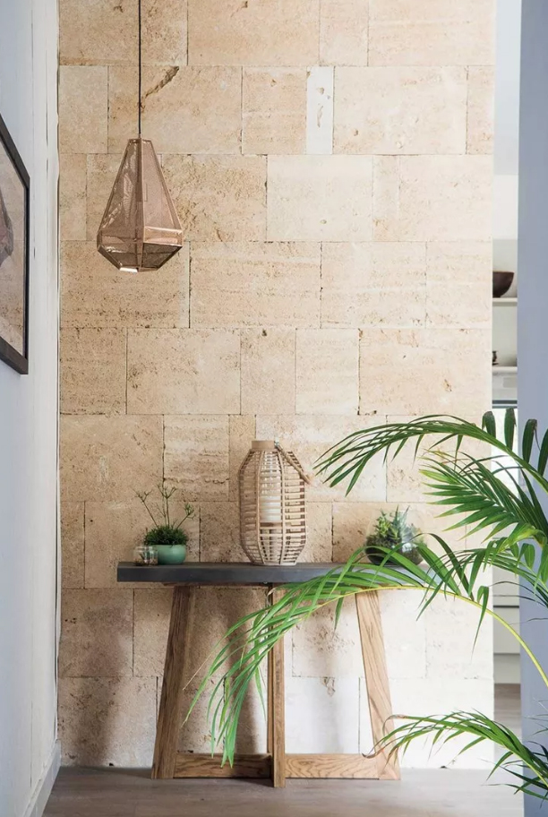
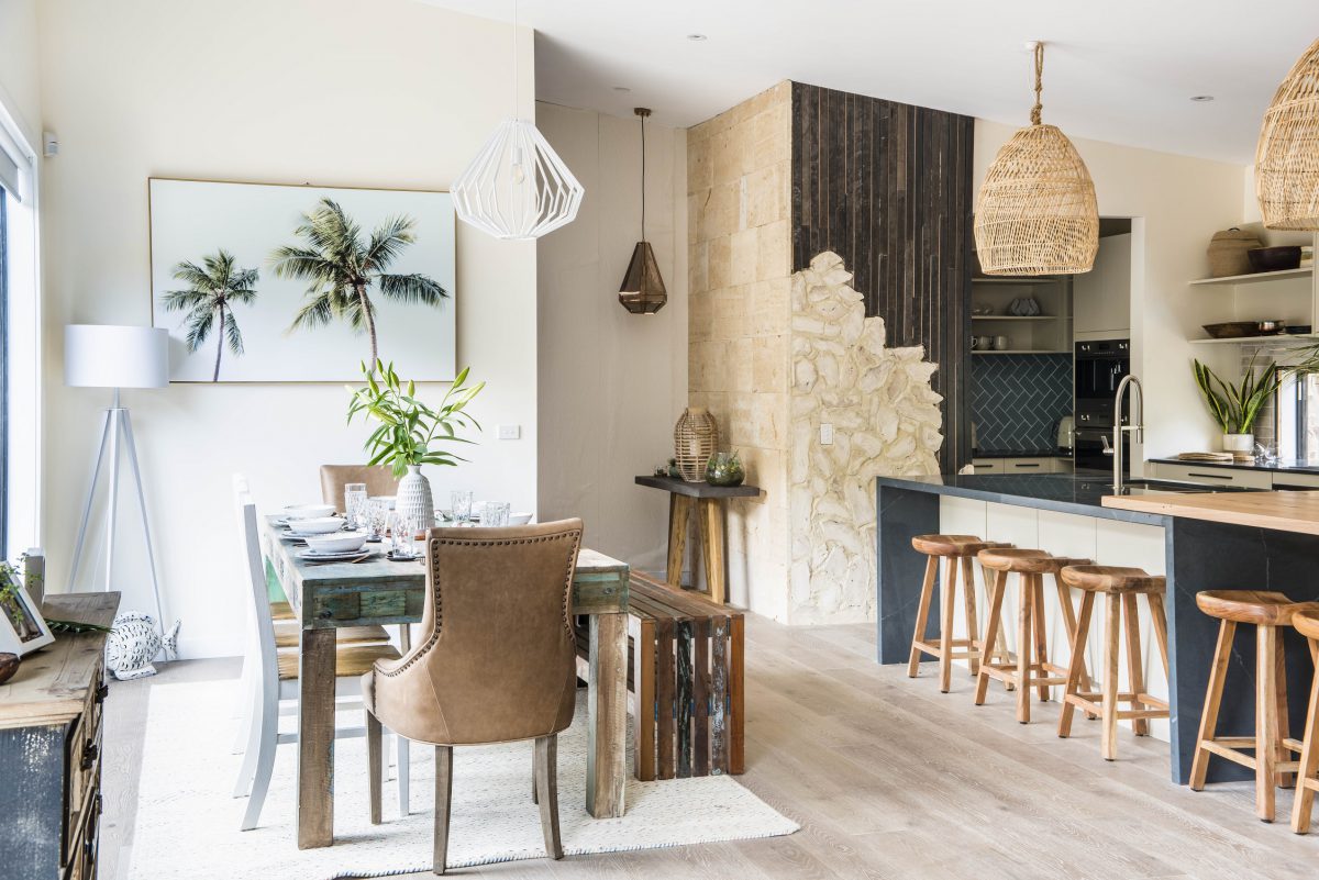
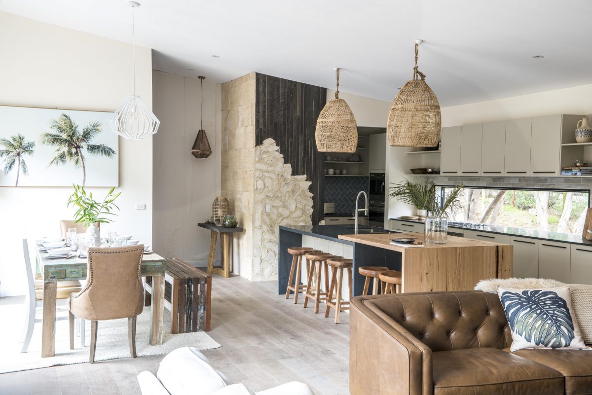
The kitchen was actually quite bearable and not gawdy. I didn’t mind the sandstone look. I’m not fussed on the strange feature wall they had going on, but hey, it’s better than what they had and it does tie in with the home.
The teams worked much better with textures and colours this week.
Here were the rules…
Leigh & Kristie’s rules:
1. Chill out with “California Cool” style
2. Get earthy with copper, timber, limestone and concrete
3. Deck out the entry hallway like a luxury yacht
4. Be bright in the family bathroom and laundry
5. Make the master suite a flowing coastal retreat
Bonus Room – Guest Bedroom
Bonus Room Rule – Give us a luxe surfie crash pad
Ok, so let’s check out all the photos…
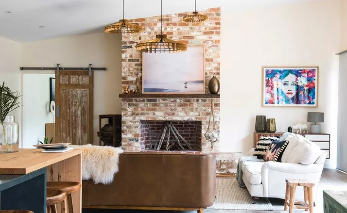
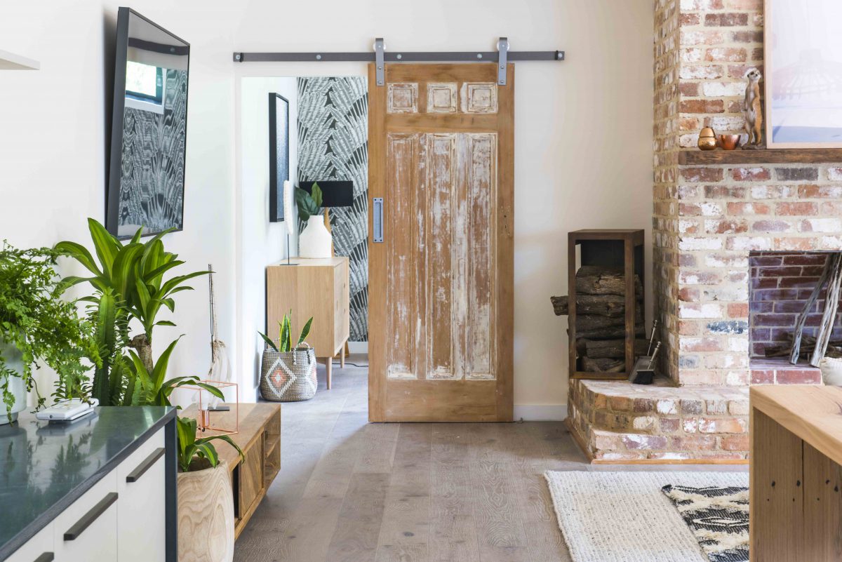
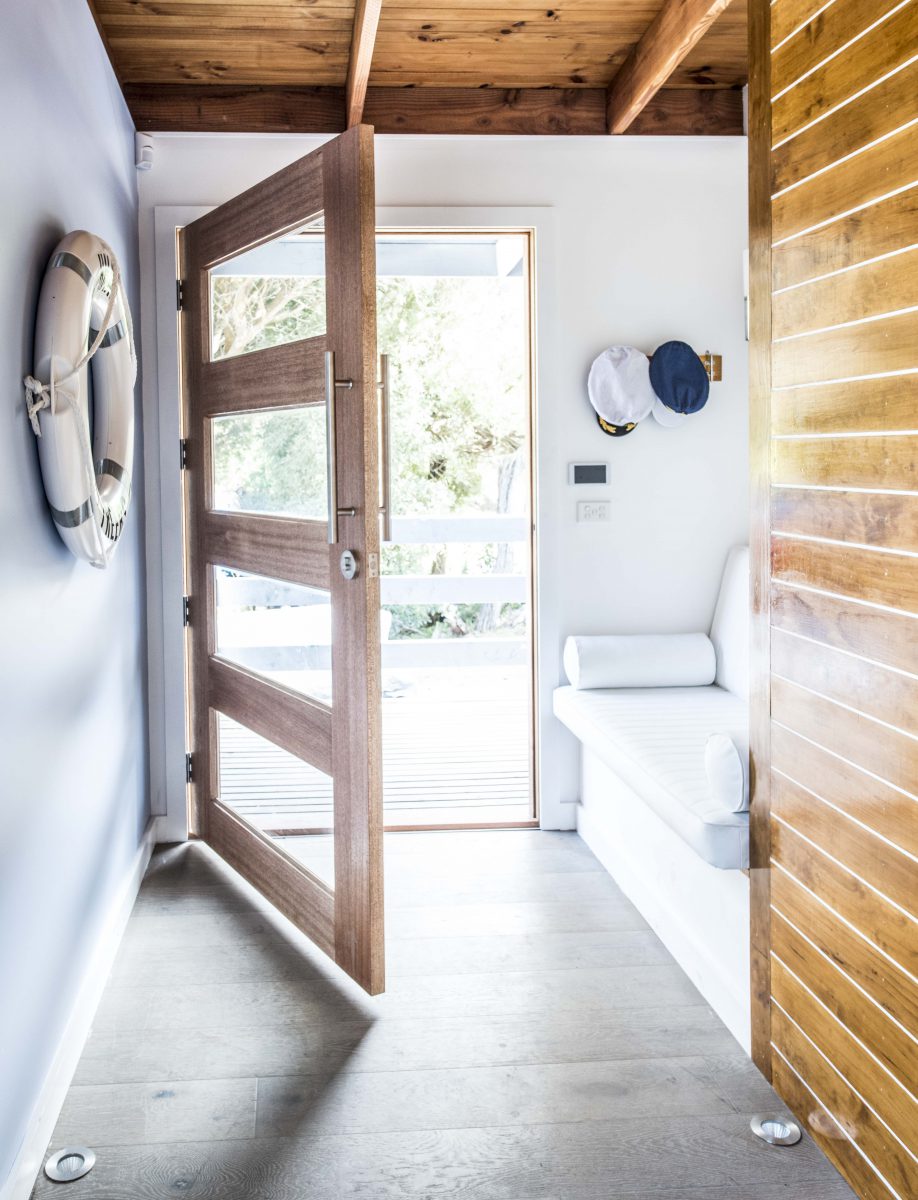
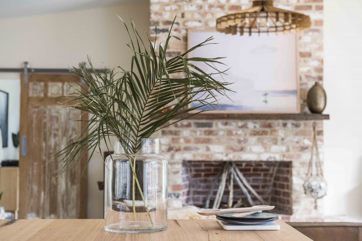
Josh & Brandon (Lounge, Powder room & Entry)
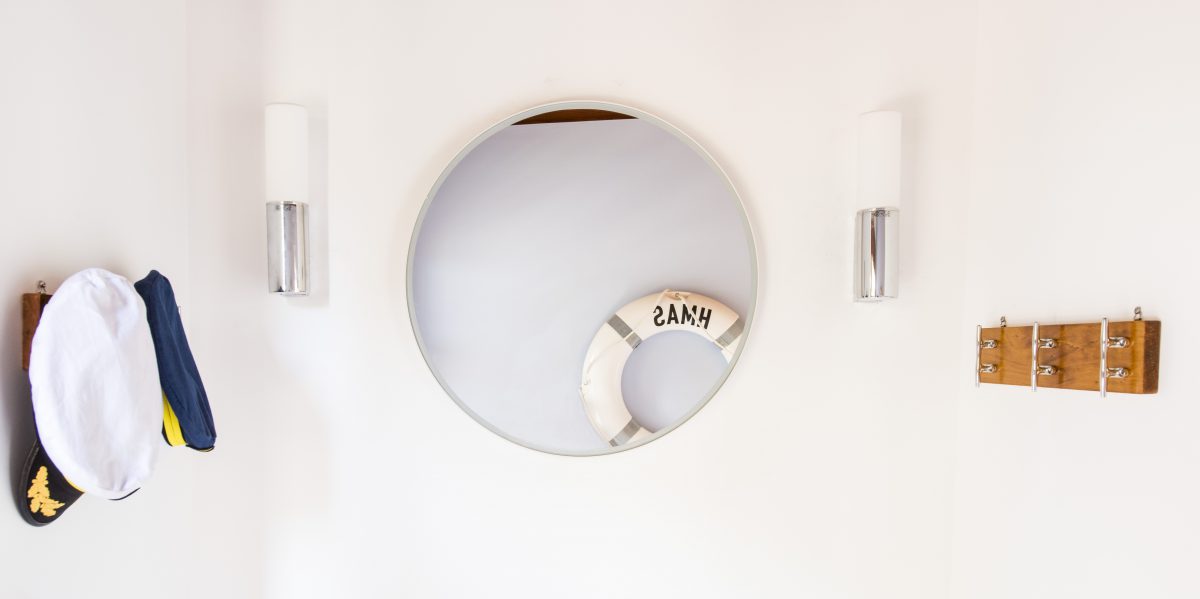
I am not sure why the boys put the tv on that odd wall. That doesn’t seem right to me. So much artwork too. They could have toned this room right back and let the fireplace and barn door be the feature on their own. Again, a non-matching couch set up. Not a fan! However, I don’t mind the lights, the cushions and the floor rug. Powder room – again too much artwork which wasn’t needed at all. But the base of it is all ok with me. Entry – I liked it, but hey what’s with the literal themed coastal stuff aka sailors hat??


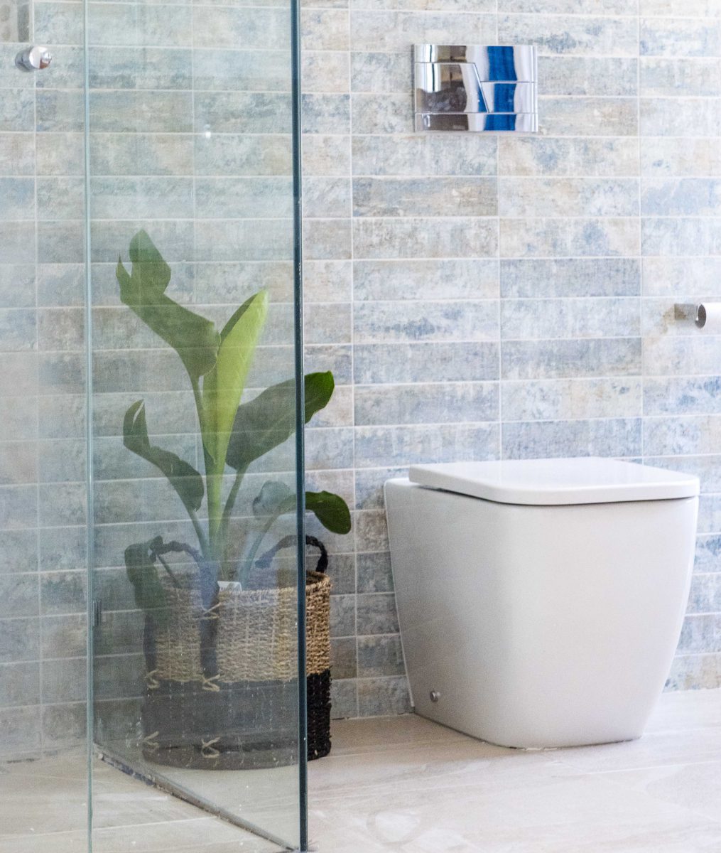
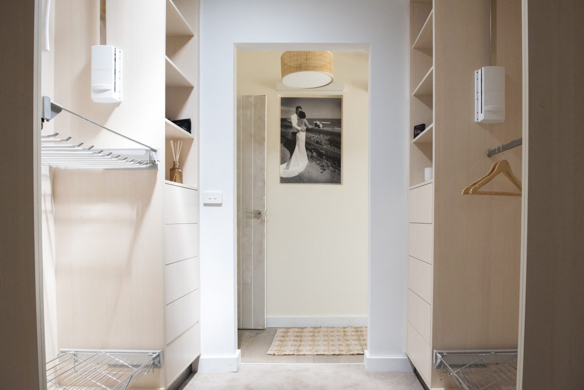
Kim & Michelle (Hallway, Bathroom, Walk-in robe)
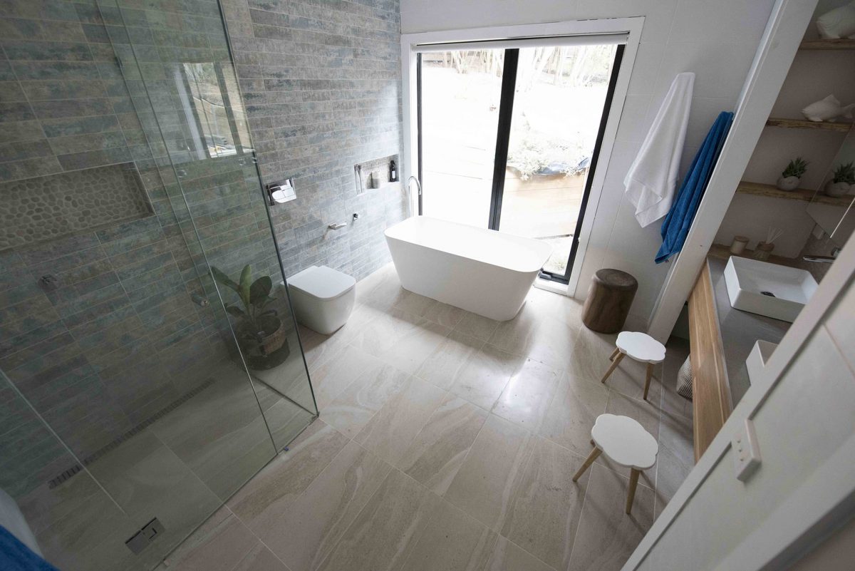
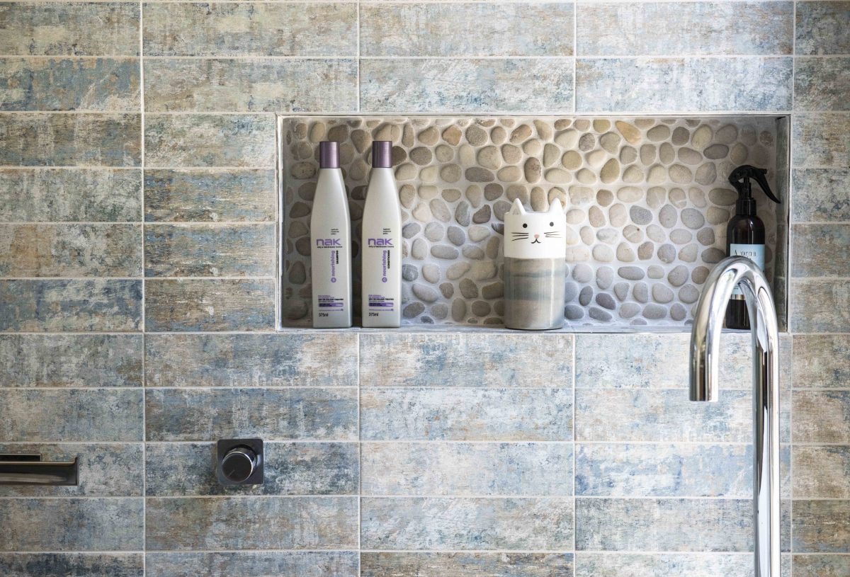
The girls did pretty well I think, considering the size of the areas they had to work with. I know the finish wasn’t great on their wallpaper job, but I actually like the colours and tones they used. The walk-in-robe wasn’t anything special, but that wouldn’t worry me at all! It’s big and functional so that’s ok with me. The bathroom – it was huge wasn’t it? I think they did pretty good. It’s nothing WOW, but they worked better with the earthy tones. The floor tiles and wall tiles were good choices (on their own), but I’m not sure they work that well together. Anyway, at least it’s an improvement and quite livable.
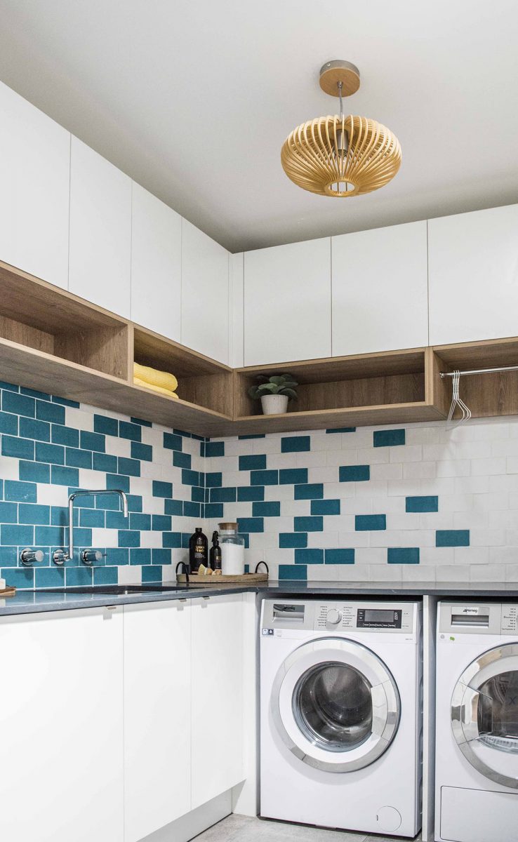
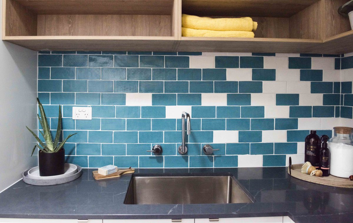
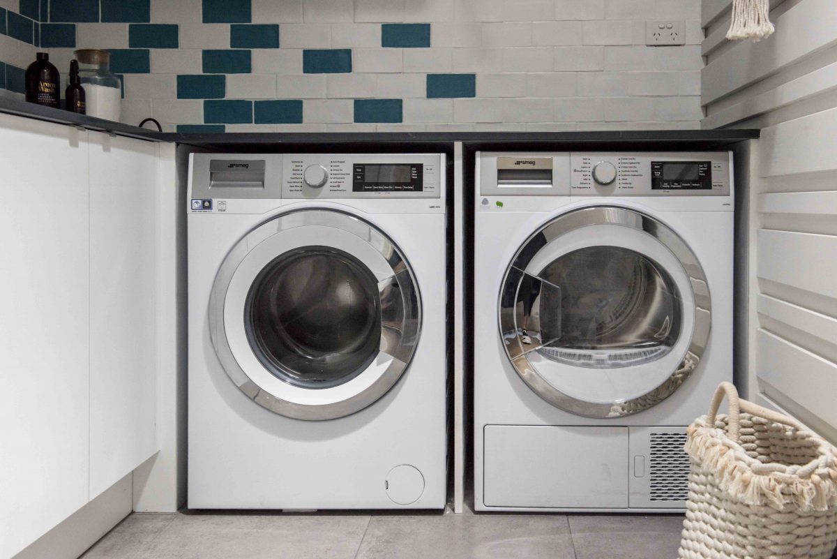
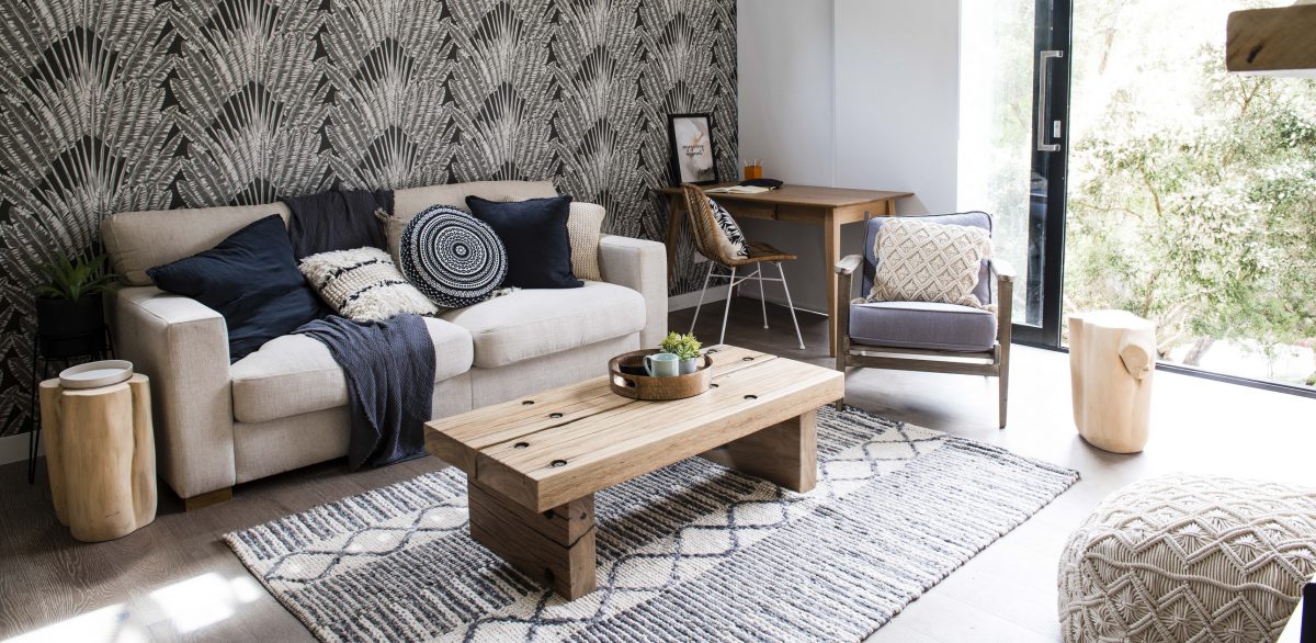
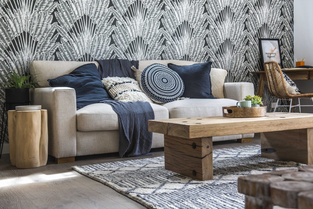
Toad & Mandy (Laundry & The Den)
The laundry wasn’t my cup of tea, but hey that’s ok! It was very functional and it could have been worse with the rule “be bright”. The den was actually very good I thought. A little over-styled, but that’s nothing major. I love the use of timber, rattan and the boho cushions. That all worked well for me.


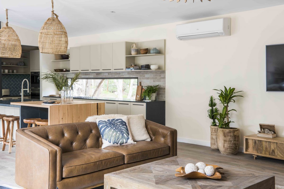
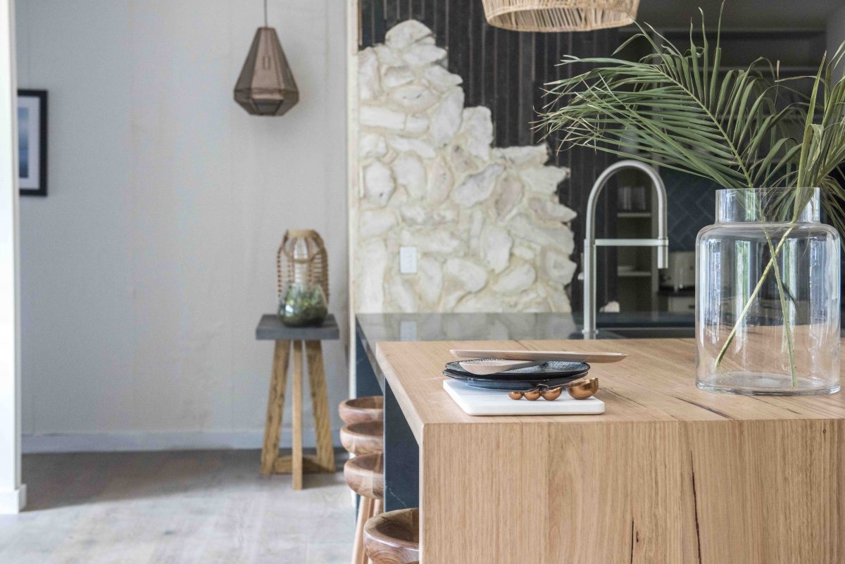
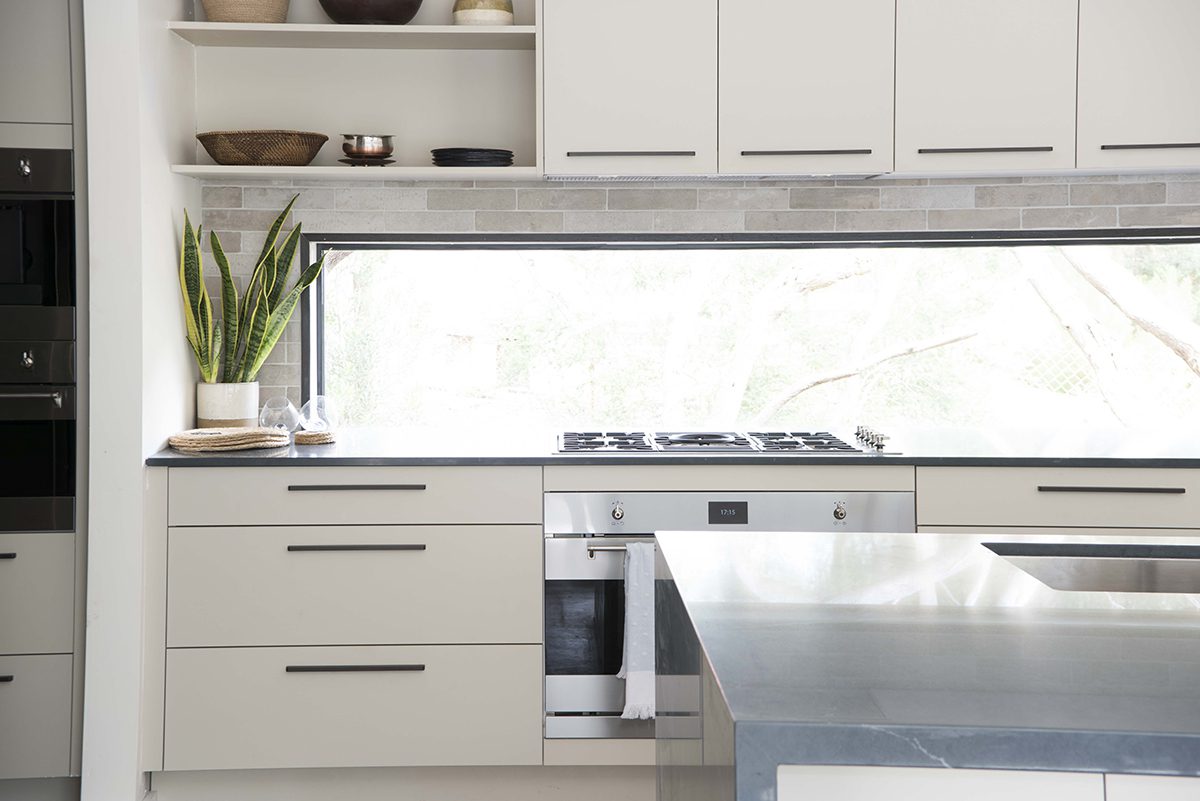
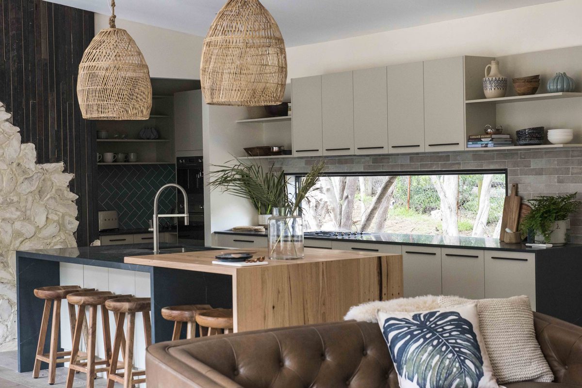
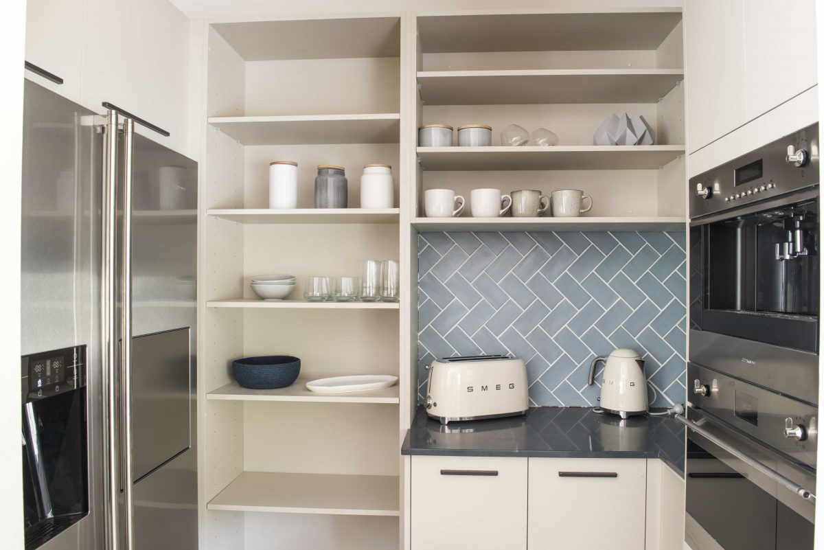
Jess & Jared (Kitchen & Kobe’s room)
They’ve actually done a pretty good job all round this week. Like I mentioned earlier, I don’t love that wall in the kitchen, but overall I think it’s a lovely space. The colours and timber finish on the island bench is a treat. I love the pendants and the whole vibe (being at the hub of the home) works well. Kobe’s bedroom is so cute and he will love it.


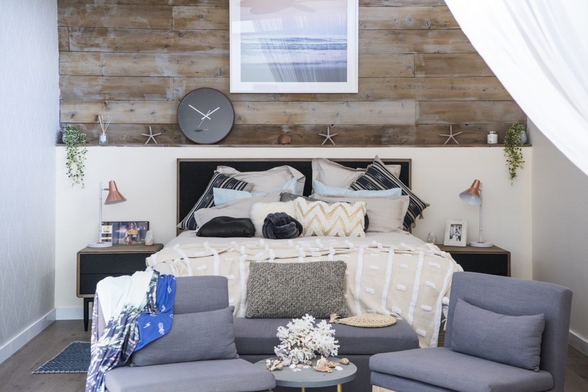
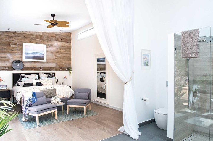
Chiara & David (Dining room & Master Bedroom)
The dining room is so over styled and I hated the table and chairs (which don’t match!). The rug is all wrong too. Actually can we just NOT put rugs under dining tables please. It might look good, but practicality wise I say nup. The master bedroom was an eyesore. The worst actually. Sorry! I just think it was a mess, like it needed a good tidy up because they were still moving in or something. I think if they halve the contents of the room then it might work better. I am also NOT a fan of the curtain. What do you think??
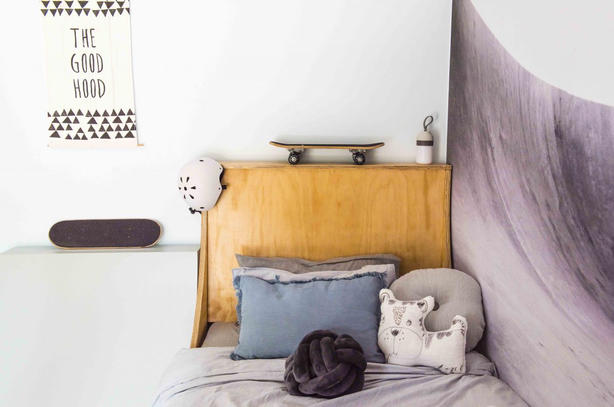
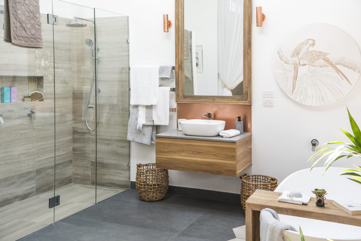
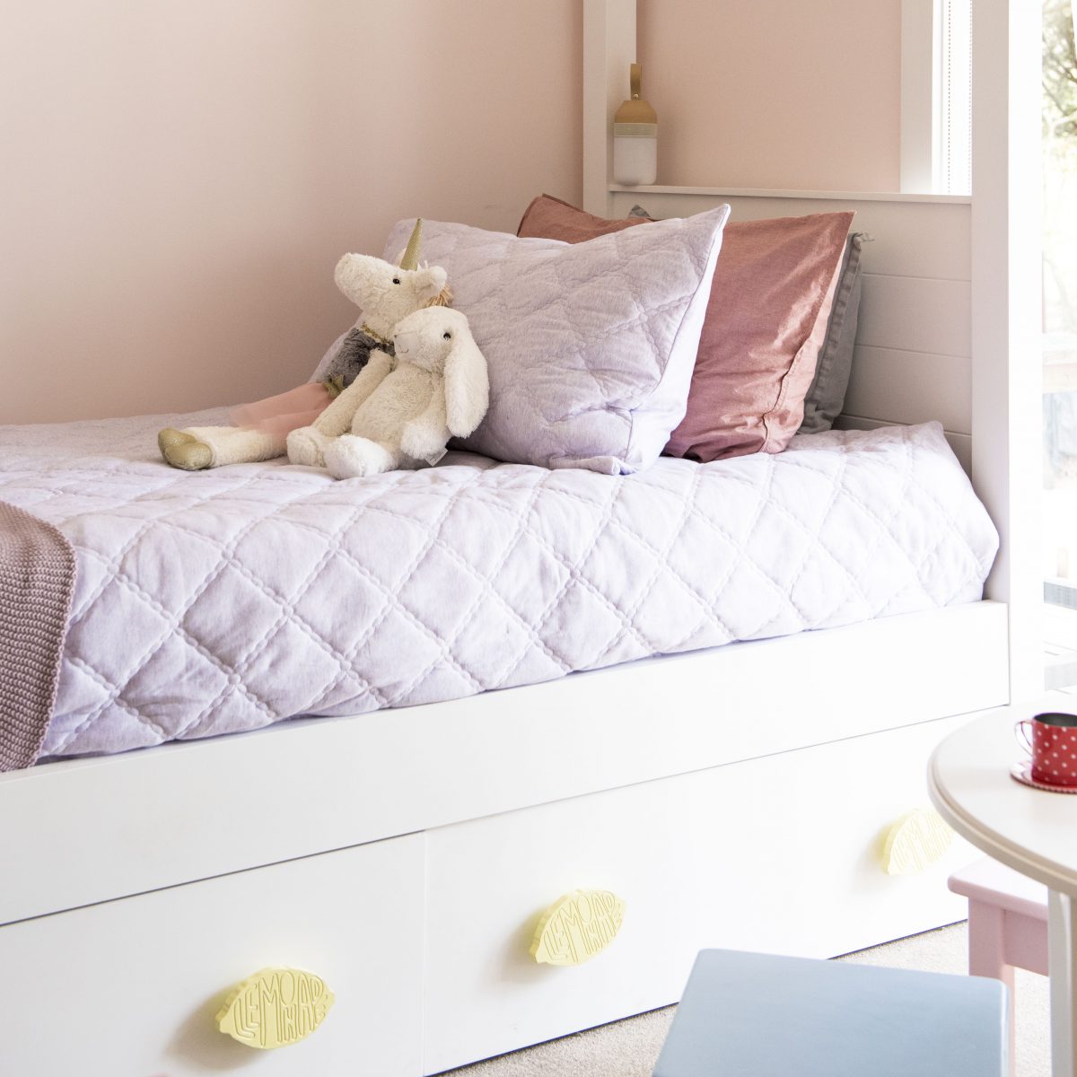
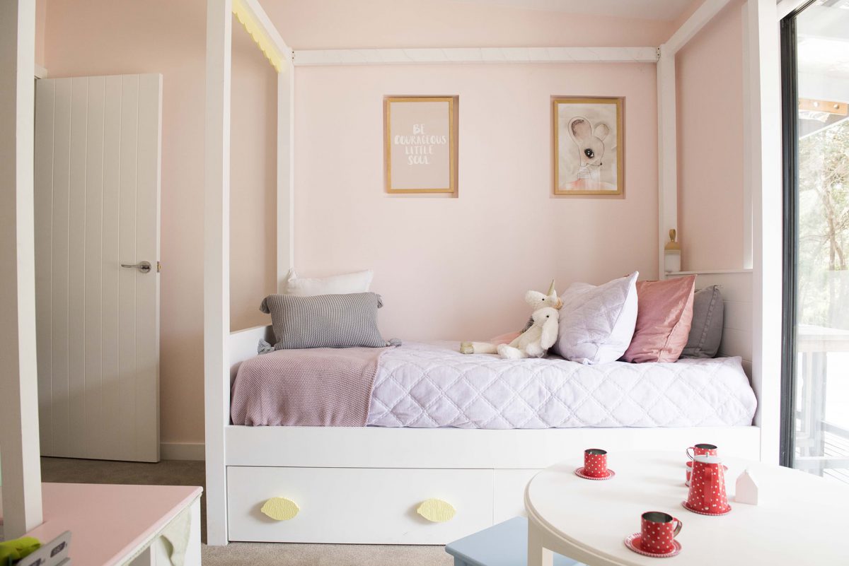
Mel & Dave (Ensuite, Billie’s room and Bonus room)
The ensuite was pretty good don’t ya think? Apart from the copper lights and the artwork, I quite liked it. Although, maybe if they’d had some doors they could have used a wall behind those for the towels and made the vanity a double sink. Also I’m not sure about the tiles. If it were me I’d have used the same tile throughout. No need for feature tiles these-days. Minimal is better! Billie’s room was cute and the guest room was lovely and fresh (although, the surfboard was a little weird).


What did you think??
You can see the previous renos here and meet the contestants here.
♥ KC.