
Come and take a look at the photos from The Block 2016 – Week 1 Ensuite Bathroom Reveals …

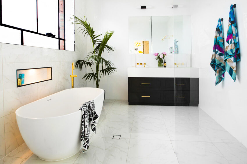


Julia and Sasha jagged the win with their take on an art deco styled bathroom. I liked the dark cabinet and the tiles over the floor/wall works a treat. It’s a pretty understated bathroom – because it looks huge to me! I may have centred the vanity because I would kill that plant no doubt – it looks like it’s just there to fill a void. Concealed cistern is a tick!
…


This is Will and Karlie’s bathroom. Yes we can all agree the strip lighting and baskets don’t need to be there. This was my favourite shower though. I love the half wall with the rose gold/black tapware peaking through the top half. And that’s a humungous shower! And they tiled all the way to the top – lots of $ spent there!
…


Here is Ben and Andy’s bathroom. I think their space seems much smaller so there was no bath? Considering 2 walls were flanked with windows I bet it was hard to get the right layout and they decided to centre the vanity under a set of them. I like the colours better in here. I think they got the concept of an ensuite right, but I wouldn’t want to be cleaning those huge glass shower doors!
…


Here is Chris and Kim’s ensuite. Not my favourite I will say. Only because the tiles are so dark and moody then the vanity is too bright. Maybe a flip would have been better – white top and grain base? The tiles on the walls and floors are great! Love the low maintenance there. Not keen on the feature tile, but I love that shower layout. A walk-though! Yes!
…


I thought Dan and Carlene’s bathroom had a really nice feel to it. I wasn’t offended at all. A couple of things though – I wouldn’t have raised the bath and the timber cupboard is a little out of place. I love the floor tiles. They are gorg. The border around the top of the tiles is beautiful and different. The same-old-same-old would be tiling to the ceiling as usual. The feature area in the shower could have been done better but I am a sucker for subway tiles and a black bath so I didn’t think this room was as hideous as everyone said. It was intriguing and fits in quite well with the overall feel of the building.
…
Which bathroom did you love? Which did you hate?