
Are you looking for a white paint but don’t know where to start? Yes, I’ve been there done that! It’s tricky to get it right (and don’t even start me on the colour grey!). Today I have a list of some white paints you might like to consider. The first thing you will need to decide on is whether you are after a COOL white or a WARM white. Once you decide which is your preference you can start to limit your choices.
Here are the 2 broken down with a few ideas for you…
Cool Whites
Cool whites are colours that have a blue, grey or green undertone. Cool colours work well in more modern homes. Usually rooms which are filled in natural light can benefit from a cool white. They offer a crisp, sleek and elegant look.
See some examples below…
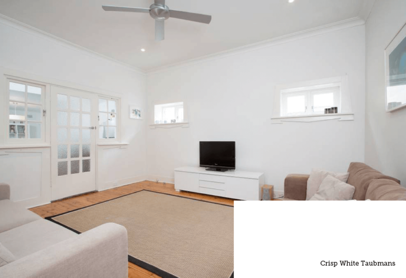
Crisp White Taubmans – probably the truest white. This is my colour at home.
…
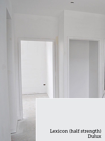
Lexicon Dulux – this room below was done in half strength (don’t forget that if you narrow your paint choices down that you can also ask for them to be in a half-tint if you think it’s a little too grey/blue).
…
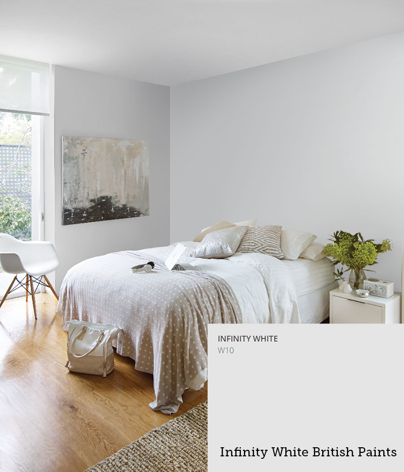
Infinity White British Paints – gorgeous colour – a little hint of grey, but not too much.
…
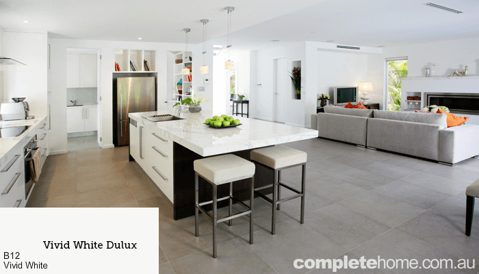
Vivid White Dulux – bright and light.
…
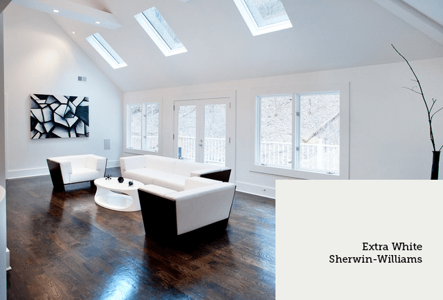
Extra White Sherwin-Williams – looks great in a large space.
…
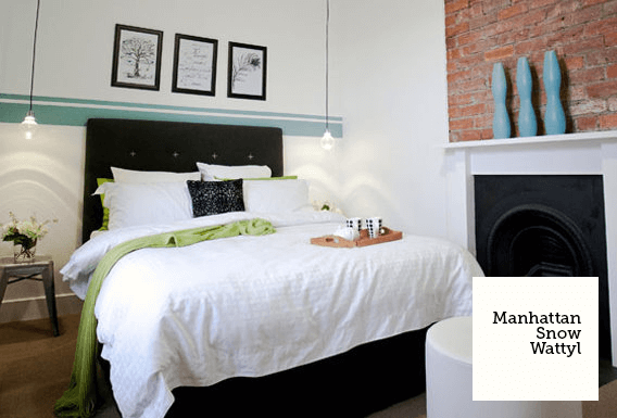
Manhattan Snow Wattyl – Amie and I used this colour in our house at The Block. We loved it!
…
Warm Whites
Warm whites are colours with yellow, red and brown undertones. They are cosy and inviting more suited to traditional styling.
See some examples below…
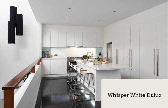
Whisper White Dulux – a little bit warmer with a slight cream undertone.
…
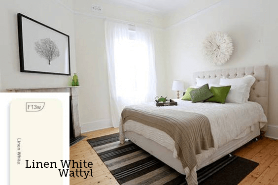
Linen White Wattyl – also a little creamer and looks great bright white gloss accents.
…
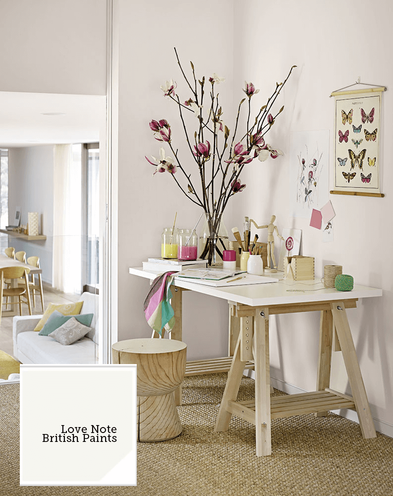
Love Note British Paints – creamy with the slightest pink tone.
…
Antique White USA Dulux – I did my last house in this. Not too creamy – just not as stark as a cool white. This is my favourite warm white paint colour.

…
Natural White Dulux – fresh brown undertone – great with timber furniture.

…
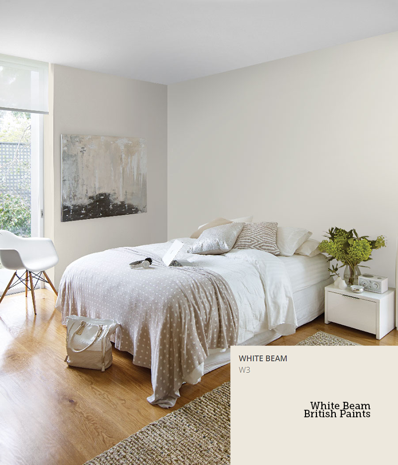
White Beam British Paints – natural and inviting.
TIPS when choosing white paint:
- Hold the swatch away from other swatches (other colours can throw it off).
- Don’t choose your colour based on the swatch laying down – make sure it’s upright.
- Buy a piece of plaster board and paint that using your colour (don’t put more than one colour on a board, create new boards per colour) and rest them in your rooms to see how they look at different times of the day.
- Think about the lighting in your room. Less light might mean your paint choice can be a little brighter/lighter or with half strength tint.
- Think about the furniture in your room. Black furniture looks better with a cooler colour, timber furniture might look better with a warmer white.
Do you have a favourite white? Or any tips for selecting white paint?
♥ KC.