
When you’re looking to paint a room or style it, do you think about how the colour will make that room feel?
I often start out with an idea of injecting a certain colour for variety, but I am really aware of how a colour makes me feel. For example, I am not a huge fan of orange. It makes me feel a little uneasy when I look at it. But I am a big lover of anything blue/green. They make me feel good.
Just like with styling, it’s important to think about the paint colours you might use within the home.
The psychology of colour in the home can evoke feelings and set the tone for your family’s emotional well-being. That might sound a little crazy but it’s true!
Before choosing a colour for a room, you need to be clear on the function of each space within your home. Is the Living room the hub of the home, or is it a quiet space where you can relax and unwind? Once you’ve worked out the function, then you can choose a predominant colour.
I found this very good infographic below which gives some for and against points on the main colours…
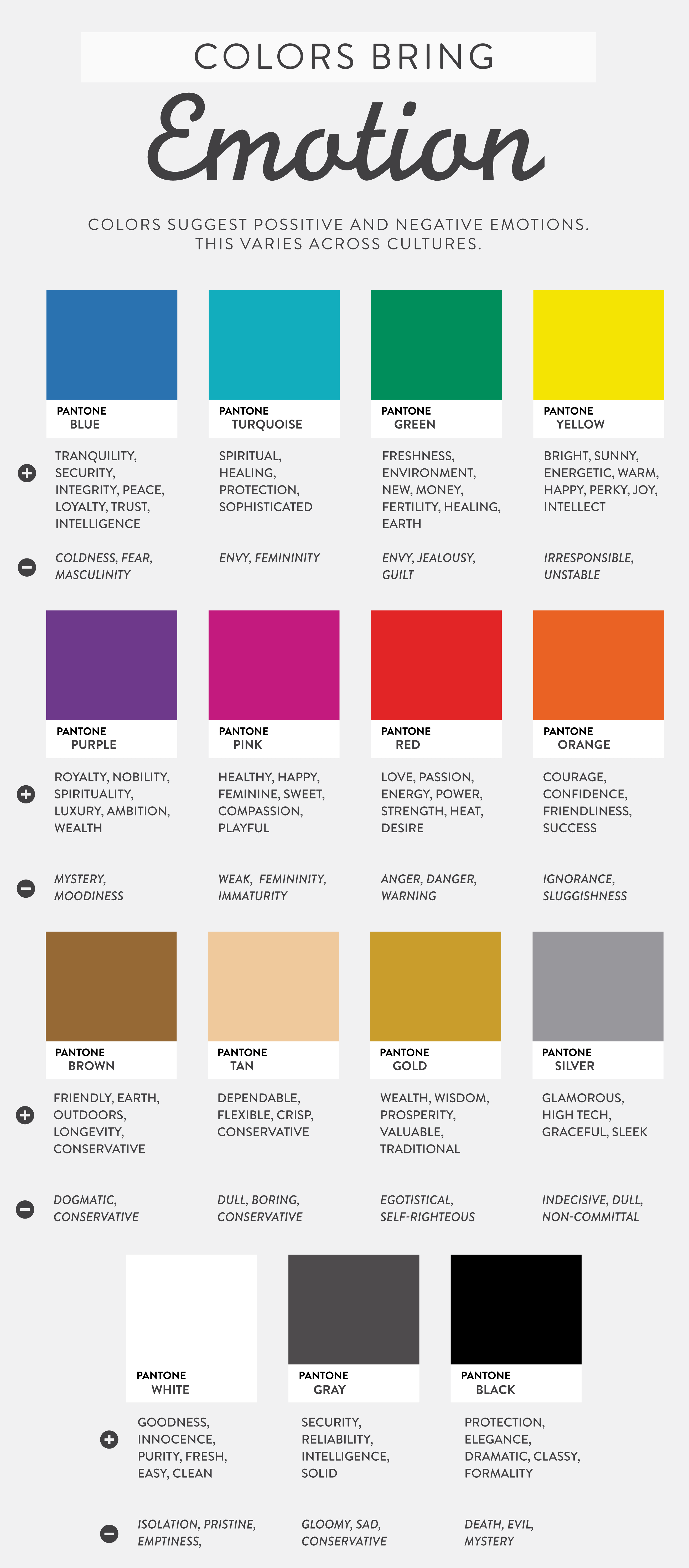
[source]
Wow, they are a little harsh on the negatives, but in saying that I did appreciate it because it made me think about what I really like and what makes me feel uneasy. The slightest change in shade and tone can also make a huge difference to an area in your home. So pink doesn’t always have to be hot pink, it can, of course, be in many different shades.
Here’s a really good colour chart which also explains the meaning of colours in more depth… (click on the image to view larger if you need to).
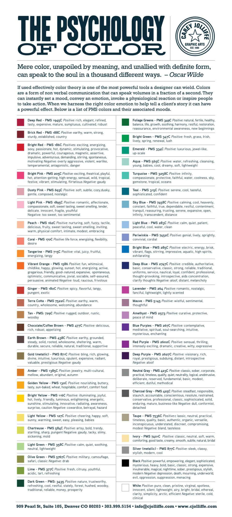
[source]
Limiting colours to a certain palette can bring a sense of calmness and minimalism too.
I like to start with a fresh, white bright base, then introduce snippets of colour and build on that until I am happy.
For example, my walls are always white. Then I usually pick a colour – like blue – as the main accent colour, then introduce a few shades of blue, and finally I pick a contrasting colour – like pink or green. I always bring it back to white though, so it’s a prominent backdrop. However, it’s ok to use a different colour to white! It would just mean that you may use less shades of that main accent colour so it doesn’t become overwhelmed.
There you go! Food for thought if you’re building a new house, or making changes to a room. You might even think of changing your office colours (if you feel a little stale in there) or even your bedroom if you aren’t sleeping very well? It’s time to encourage some more productivity and I think a change of colour in my home office might do the trick!
♥ KC.